This blog is part of Matplotlib Series:
- Matplotlib Series 1: Bar chart (this blog)
- Matplotlib Series 2: Line chart
- Matplotlib Series 3: Pie chart
- Matplotlib Series 4: Scatter plot
- Matplotlib Series 5: Treemap
- Matplotlib Series 6: Venn diagram
- Matplotlib Series 7: Area chart
- Matplotlib Series 8: Radar chart
- Matplotlib Series 9: Word cloud
- Matplotlib Series 10: Lollipop plot
- Matplotlib Series 11: Histogram
Bar chart
A bar chart or bar graph is a chart or graph that presents categorical data with rectangular bars with heights or lengths proportional to the values that they represent. The bars can be plotted vertically or horizontally.
When to use it ?
- Compare categorical data.
- Comparisons among discrete categories.
- One axis of the chart shows the specific categories being compared, and the other axis represents a measured value.
Example
import matplotlib.pyplot as plt
import numpy as np
x = np.arange(4)
turnover_k_euros = [12, 34, 31, 20]
plt.bar(x, turnover_k_euros, width=0.4)
plt.xticks(np.arange(4), ('apple', 'banana', 'cherry', 'durian'))
plt.xlabel('Product')
plt.ylabel('Turnover (K euros)')
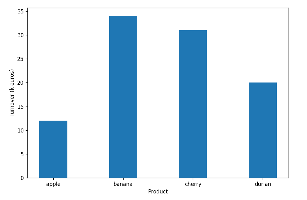
plt.show()This plot describes turnovers(k euros) for each fruit. Among four fruits, bananas’ sales bring the largest turnover (34k euros), however, it seems that consumers don’t like apple that much.
Grouped bar chart
Bar graphs can also be used for more complex comparisons of data with grouped bar charts and stacked bar charts. In a grouped bar chart, for each categorical group there are two or more bars. These bars are color-coded to represent a particular grouping.
When to use it ?
To represent and compare different categories of two or more groups.
Example
year_n_1 = (20, 35, 30, 35, 27, 27, 33)
year_n = (25, 39, 45, 25, 21, 29, 36)
ind = np.arange(7)
width = 0.35
fig, ax = plt.subplots(figsize=(9, 6))
rects1 = ax.bar(ind - width / 2, year_n_1,
width, color='#1f77b4', alpha=0.5)
rects2 = ax.bar(ind + width / 2, year_n,
width, color='#1f77b4')
plt.legend((rects1[0], rects2[0]), ('year N-1', 'year N'))
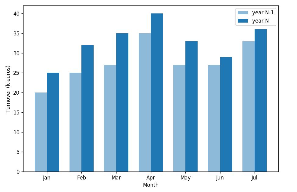
plt.show()This plot compares monthly turnover of year N to year N-1. Except for April and May, monthly turnover in year N is higher than year N-1. In the case of retailing, this kind of changes can be explained like the strategy of year N works well, or new products attract clients, or new stores of year N contribute to the turnover.
Stacked bar chart
Alternatively, a stacked bar chart could be used. The stacked bar chart stacks bars that represent different groups on top of each other. The height of the resulting bar shows the combined result of the groups.
When to use it ?
- To compare the totals and one part of the totals.
- If the total of your parts is crucial, stacked column chart can work well for dates.
Example
cheese = (20, 35, 30, 35, 27, 37, 20)
non_cheese = (25, 32, 34, 20, 25, 17, 29)
rect1 = plt.bar(np.arange(7), cheese,
width=0.5, color='orangered')
rect2 = plt.bar(np.arange(7), non_cheese,
bottom=cheese, width=0.5, color='#1f77b4')
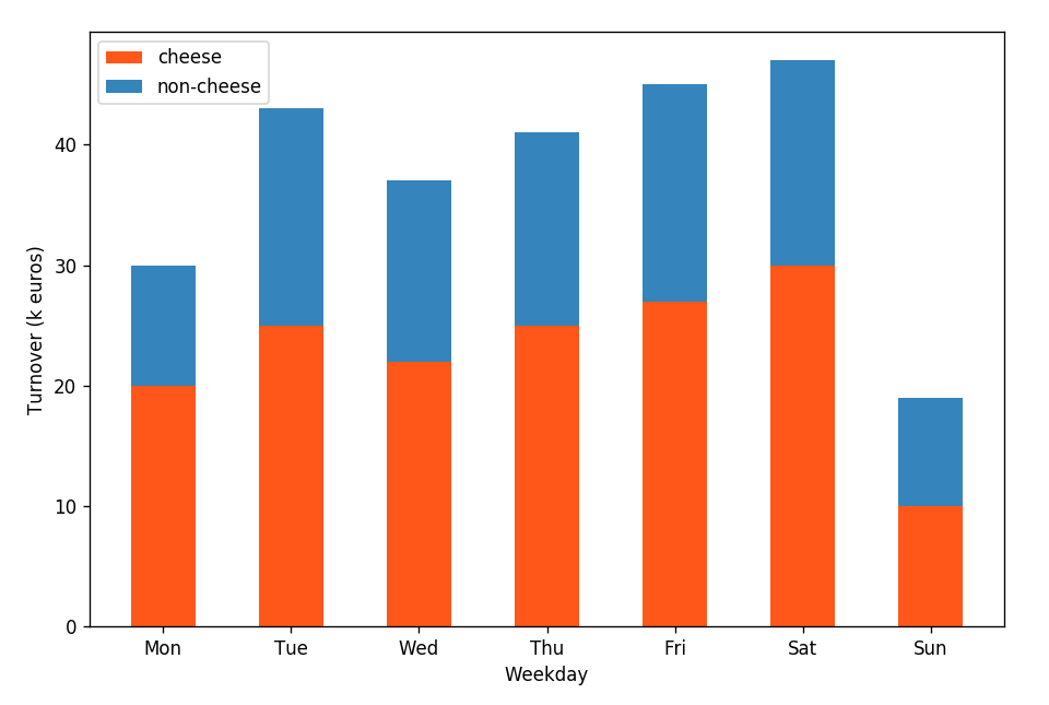
plt.show()This plot presents weekdays’ turnover with cheese and non-cheese products’ sales. Globally, the sales of cheese products are much more than others.
Vertical bar chart
The horizontal bar chart is the same as a vertical bar chart only the x-axis and y-axis are switched.
When to use it ?
- You need more room to fit text labels for categorical variables.
- When you work with a big dataset, horizontal bar charts tend to work better in a narrow layout such as mobile view.
Example
df = pd.DataFrame({'product': ['grill', 'cheese', 'red wine', 'salade',
'chicken', 'sushi', 'pizza', 'soup'],
'turnover': [846, 739, 639, 593, 572, 493, 428, 293]},
columns=['product', 'turnover'])
df.sort_values('turnover', inplace=True)
df.reset_index(inplace=True, drop=True)
plt.barh(np.arange(len(df['product'])), df['turnover'], align='center')
plt.yticks(np.arange(len(df['product'])), df['product'])
plt.tick_params(labelsize=12)
plt.xlabel('Turnover(k euros)', fontdict={'fontsize': 13})
plt.ylabel('Product', fontdict={'fontsize': 13})
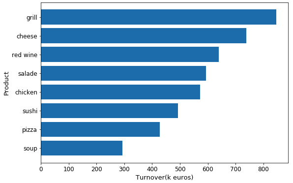
plt.show()This vertical bar chart describes clearly turnover for each product. Obviously, grill product is prefered by clients.
You can click here to check this example in jupyter notebook.
Reference
- Steve Johnson, “painting wallpaper”, www.pexels.com. [Online]. Available: https://www.pexels.com/photo/painting-wallpaper-1070527/