This blog is part of Matplotlib Series:
- Matplotlib Series 1: Bar chart
- Matplotlib Series 2: Line chart
- Matplotlib Series 3: Pie chart
- Matplotlib Series 4: Scatter plot
- Matplotlib Series 5: Treemap
- Matplotlib Series 6: Venn diagram
- Matplotlib Series 7: Area chart
- Matplotlib Series 8: Radar chart
- Matplotlib Series 9: Word cloud
- Matplotlib Series 10: Lollipop plot (this blog)
- Matplotlib Series 11: Histogram
Lollipop plot
A lollipop plot is an hybrid between a scatter plot and a barplot.
When to use it ?
- Showing the relationship between a numerical variable and another numerical or categorical variable.
Example 1
import datetime
import numpy as np
import pandas as pd
import matplotlib.pyplot as plt
(markerline, stemlines, baseline) = plt.stem(df['Product'],
df['Turnover'])
plt.setp(markerline, marker='*', markersize=15,
markeredgewidth=2, color='gold')
plt.setp(stemlines, color='gold')
plt.setp(baseline, visible=False)
plt.tick_params(labelsize=12)
plt.xlabel('Product', size=12)
plt.ylabel('Turnover(k euros)', size=12)
plt.ylim(bottom=0)
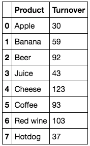
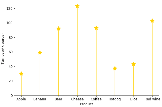
plt.show()This plot describes turnovers(k euros) for each product. Among eight products, cheese’s sales bring the largest turnover (123k euros), however, it seems that consumers don’t like apple that much.
Example 2
ordered_df = df.sort_values(by='Turnover').reset_index(drop=True)
my_range = range(1, len(df.index) + 1)
plt.hlines(y=my_range, xmin=0, xmax=ordered_df['Turnover'],
color='skyblue')
plt.plot(ordered_df['Turnover'], my_range, 'o', markersize=11)
plt.yticks(ordered_df.index+1, ordered_df['Product'])
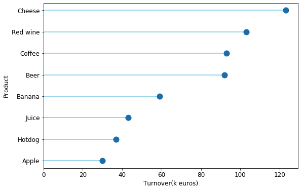
plt.show()This vertical lollipop plot describes clearly turnover for each product. Obviously, cheese is prefered by clients.
You can click here to check this example in jupyter notebook.
Reference
- Steve Johnson, “painting wallpaper”, www.pexels.com. [Online]. Available: https://www.pexels.com/photo/painting-wallpaper-1070527/