This blog is part of Matplotlib Series:
- Matplotlib Series 1: Bar chart
- Matplotlib Series 2: Line chart
- Matplotlib Series 3: Pie chart
- Matplotlib Series 4: Scatter plot
- Matplotlib Series 5: Treemap
- Matplotlib Series 6: Venn diagram
- Matplotlib Series 7: Area chart (this blog)
- Matplotlib Series 8: Radar chart
- Matplotlib Series 9: Word cloud
- Matplotlib Series 10: Lollipop plot
- Matplotlib Series 11: Histogram
Area chart
An area chart or area graph displays graphically quantitative data. It is based on the line chart. The area between axis and line are commonly emphasized with colors, textures and hatchings.
When to use it ?
- Show or compare a quantitative progression over time.
Example 1
import datetime
import numpy as np
import pandas as pd
import matplotlib.pyplot as plt
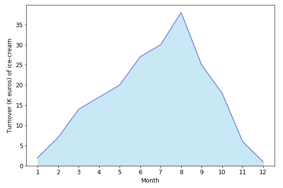
turnover = [2, 7, 14, 17, 20, 27, 30, 38, 25, 18, 6, 1]
plt.fill_between(np.arange(12), turnover,
color="skyblue", alpha=0.4)
plt.plot(np.arange(12), turnover, color="Slateblue",
alpha=0.6, linewidth=2)
plt.tick_params(labelsize=12)
plt.xticks(np.arange(12), np.arange(1,13))
plt.xlabel('Month', size=12)
plt.ylabel('Turnover (K euros) of ice-cream', size=12)
plt.ylim(bottom=0)
plt.show()Suppose that the plot above describes the turnover(k euros) of ice-cream’s sales during one year. According to the plot, we can clearly find that the sales reach a peak in summer, then fall from autumn to winter, which is logical.
Example 2
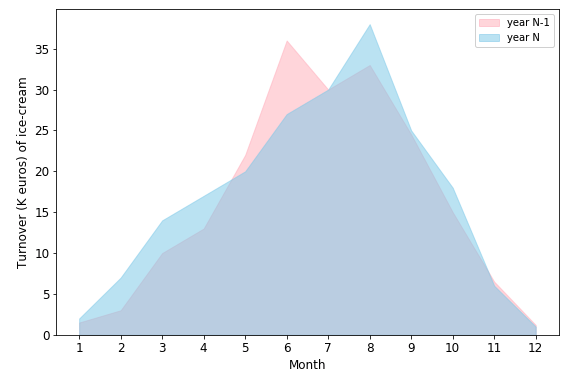
year_n_1 = [1.5, 3, 10, 13, 22, 36, 30, 33, 24.5, 15, 6.5, 1.2]
year_n = [2, 7, 14, 17, 20, 27, 30, 38, 25, 18, 6, 1]

plt.fill_between(np.arange(12), year_n_1, color="lightpink",
                 alpha=0.5, label='year N-1')
plt.fill_between(np.arange(12), year_n, color="skyblue",
                 alpha=0.5, label='year N')

plt.legend()
plt.show()
As an extension of the first plot, the second one compares two-year turnover together. The peak for both year is in the summer, for year N, the peak is in August; however, the peak is reached in June in the year N-1, which is caused by the heatwave in June.
Stacked area chart
Stacked Area Graphs work in the same way as simple Area Graphs do, except for the use of multiple data series that start each point from the point left by the previous data series.
When to use it ?
- Represent cumulated totals using numbers or percentages over time.
- Visualize part-to-whole relationships, helping show how each category contributes to the cumulative total.
Example
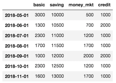
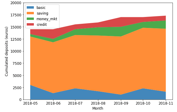
plt.stackplot(bank_account_df.index,
              [bank_account_df['basic'], bank_account_df['saving'],
               bank_account_df['money_mkt'], bank_account_df['credit']],
              labels=['basic', 'saving', 'money_mkt', 'credit'],
              alpha=0.8)

plt.legend(loc=2, fontsize='large')
plt.show()
This stacked area chart displays the amounts’ changes in each account, their contribution to total amount (in term of value) as well.
100% Stacked Area Chart
Data plotted as areas and stacked so that the cumulative area always represents 100%.
When to use it ?
- This is best used to show distribution of categories as parts of a whole, where the cumulative total is unimportant.
Example
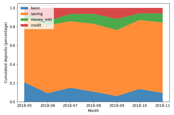
data_perc = bank_account_df.divide(bank_account_df.sum(axis=1), axis=0)

plt.stackplot(data_perc.index,
              [data_perc['basic'], data_perc['saving'],
               data_perc['money_mkt'], data_perc['credit']],
              labels=['basic', 'saving', 'money_mkt', 'credit'],
              alpha=0.8)

plt.show()
This stacked area chart displays the amounts’ changes in each account, their contribution to total amount (in term of percentage) as well.
You can click here to check this example in jupyter notebook.
Reference
- HOW TO DESIGN AREA CHARTS
- 100% Stacked Area Chart
- Steve Johnson, “painting wallpaper”, www.pexels.com. [Online]. Available: https://www.pexels.com/photo/painting-wallpaper-1070527/