This blog is part of Matplotlib Series:
- Matplotlib Series 1: Bar chart
- Matplotlib Series 2: Line chart
- Matplotlib Series 3: Pie chart
- Matplotlib Series 4: Scatter plot (this blog)
- Matplotlib Series 5: Treemap
- Matplotlib Series 6: Venn diagram
- Matplotlib Series 7: Area chart
- Matplotlib Series 8: Radar chart
- Matplotlib Series 9: Word cloud
- Matplotlib Series 10: Lollipop plot
- Matplotlib Series 11: Histogram
Scatter plot
A scatter plot (also called a scatter graph, scatter chart, scattergram, or scatter diagram) is a type of plot or mathematical diagram using Cartesian coordinates to display values for typically two variables for a set of data.
When to use it ?
Scatter plots are used when you want to show the relationship between two variables. Scatter plots are sometimes called correlation plots because they show how two variables are correlated.
Example 1
import numpy as np
import matplotlib.pyplot as plt
from matplotlib_venn import venn2
import squarify
plt.scatter(x=range(77, 770, 10),
y=np.random.randn(70)*55+range(77, 770, 10),
s=200, alpha=0.6)
plt.tick_params(labelsize=12)
plt.xlabel('Surface(m2)', size=12)
plt.ylabel('Turnover (K euros)', size=12)
plt.xlim(left=0)
plt.ylim(bottom=0)
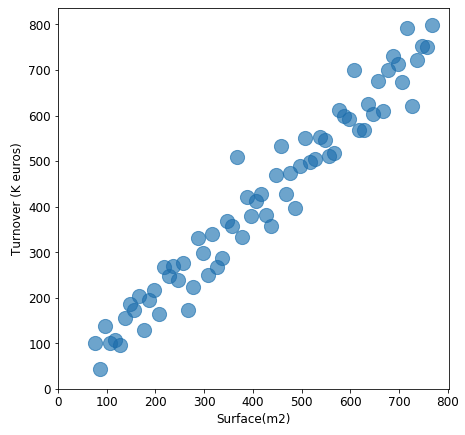
plt.show()This plot describes the positive relation between store’s surface and its turnover(k euros), which is reasonable: for stores, the larger it is, more clients it can accept, more turnover it will generate.
Example 2
plt.scatter(x=range(-10, 38, 1), y=range(770, 60, -15)-np.random.randn(48)*40,
s=200,
alpha=0.6)
plt.xlabel('Temperature(°C)', size=12)
plt.ylabel('Volume per store', size=12)
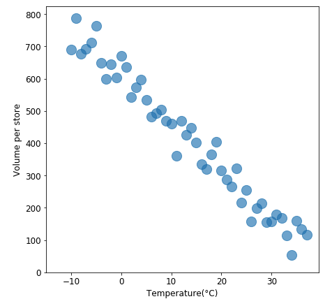
plt.show()This chart displays a negative relation between two variables: temperature and average volume of hot soup. When it gets colder, people need to think something hot to keep them warmer, however, when it becomes hotter, the needs of hot soup decreases.
Example 3
plt.scatter(x=range(20, 80, 1), y=np.abs(np.random.randn(60)*40),
s=200,
alpha=0.6)
plt.xlabel('Age', size=12)
plt.ylabel('Average purchase cost per week(euros)', size=12)
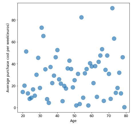
plt.show()This plot shows that there is no relation between client’s age and their purchase cost per week. Thus, we shouldn’t study their relationship for this case.
Connected scatter plot
A connected scatter plot is a mix between scatter plot and line chart, it uses line segments to connect consecutive scatter plot points, for example to illustrate trajectories over time.
When to use it ?
The connected scatterplot visualizes two related time series in a scatterplot and connects the points with a line in temporal sequence.
Example
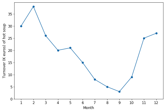
turnover = [30, 38, 26, 20, 21, 15, 8, 5, 3, 9, 25, 27]
plt.plot(np.arange(12), turnover, marker='o')

plt.show()
Suppose that the plot above describes the turnover(k euros) of hot soup’s sales during one year. According to the plot, we can clearly find that the sales reach a peak in winter, then fall from spring to summer, which is logical.
Bubble chart
A bubble chart is a type of chart that displays three dimensions of data, the value of an additional variable is represented through the size of the dots.
When to use it ?
For conveying information regarding a third data element per observation.
Example
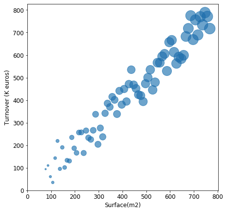
nbclients = range(10, 494, 7)
plt.scatter(x=range(77, 770, 10),
            y=np.random.randn(70)*55+range(77, 770, 10),
            s=nbclients, alpha=0.6)

plt.show()
Since I added number of clients as size of each point, which corresponds the explication of the scatter plot above.
Scatter plot with different colors
Scatter plot which created by matplotlib, cannot specify colors in terms of category variable’s value. So we have to overlap plots of different colors.
Example 1
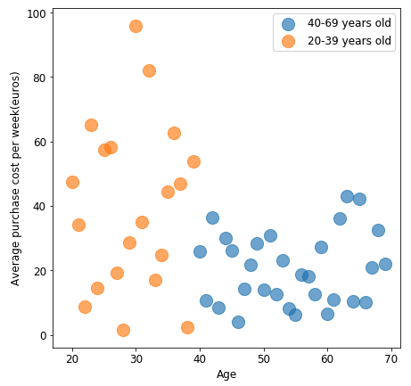
plt.scatter(x=range(40, 70, 1),
            y=np.abs(np.random.randn(30)*20),
            s=200,
            alpha=0.6,
            label='40-69 years old')
plt.scatter(x=range(20, 40, 1),
            y=np.abs(np.random.randn(20)*40),
            s=200,
            alpha=0.6,
            label='20-39 years old')
plt.show()
This 2-color scatter plot displays clearly the difference of weekly purchase cost between young people and middle aged or elderly people: average weekly purchase of younger people is nealy once more than middle aged or elderly people.
Example 2
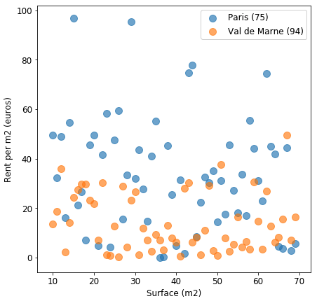
plt.scatter(x=range(10, 70, 1),
            y=np.abs(np.random.randn(60)*40),
            s=100,
            alpha=0.6,
            label='Paris (75)')
plt.scatter(x=range(10, 70, 1),
            y=np.abs(np.random.randn(60)*20),
            s=100,
            alpha=0.6,
            label='Val de Marne (94)')
plt.show()
In this plot, some points are overlapped, which will impact our analysis. In this case, it’s better to separate samples of “Paris (75)” and “Val de Marne (94)” into 2 plot:
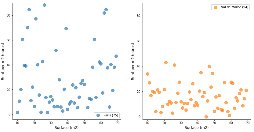
fig, axarr = plt.subplots(nrows=1, ncols=2, figsize=(14, 7))

axarr[0].scatter(x=range(10, 70, 1),
                 y=np.abs(np.random.randn(60)*40),
                 s=100,
                 alpha=0.6,
                 label='Paris (75)')
axarr[1].scatter(x=range(10, 70, 1),
                 y=np.abs(np.random.randn(60)*20),
                 s=100,
                 alpha=0.6,
                 label='Val de Marne (94)',
                 color='#ff7f01')
plt.show()
Comparing to the first plot of this example, the graphs above are more clearer and explicable. The rent price per m2 of Val de Marne is almost half of the rent price / m2 of Paris.
You can click here to check this example in jupyter notebook.
Reference
- When to use a scatter plot?
- The Connected Scatterplot for Presenting Paired Time Series
- Effective Use of Bubble Charts
- Steve Johnson, “painting wallpaper”, www.pexels.com. [Online]. Available: https://www.pexels.com/photo/painting-wallpaper-1070527/