This blog is part of Matplotlib Series:
- Matplotlib Series 1: Bar chart
- Matplotlib Series 2: Line chart (this blog)
- Matplotlib Series 3: Pie chart
- Matplotlib Series 4: Scatter plot
- Matplotlib Series 5: Treemap
- Matplotlib Series 6: Venn diagram
- Matplotlib Series 7: Area chart
- Matplotlib Series 8: Radar chart
- Matplotlib Series 9: Word cloud
- Matplotlib Series 10: Lollipop plot
- Matplotlib Series 11: Histogram
Line chart
A line chart or line graph is a type of chart which displays information as a series of data points called ‘markers’ connected by straight line segments. A line chart is often used to visualize a trend in data over intervals of time – a time series – thus the line is often drawn chronologically.
When to use it ?
- Track changes over time
- x-axis displays continuous variables
- Y-axis displays measurement
Example
import pandas as pd
import numpy as np
import matplotlib.pyplot as plt
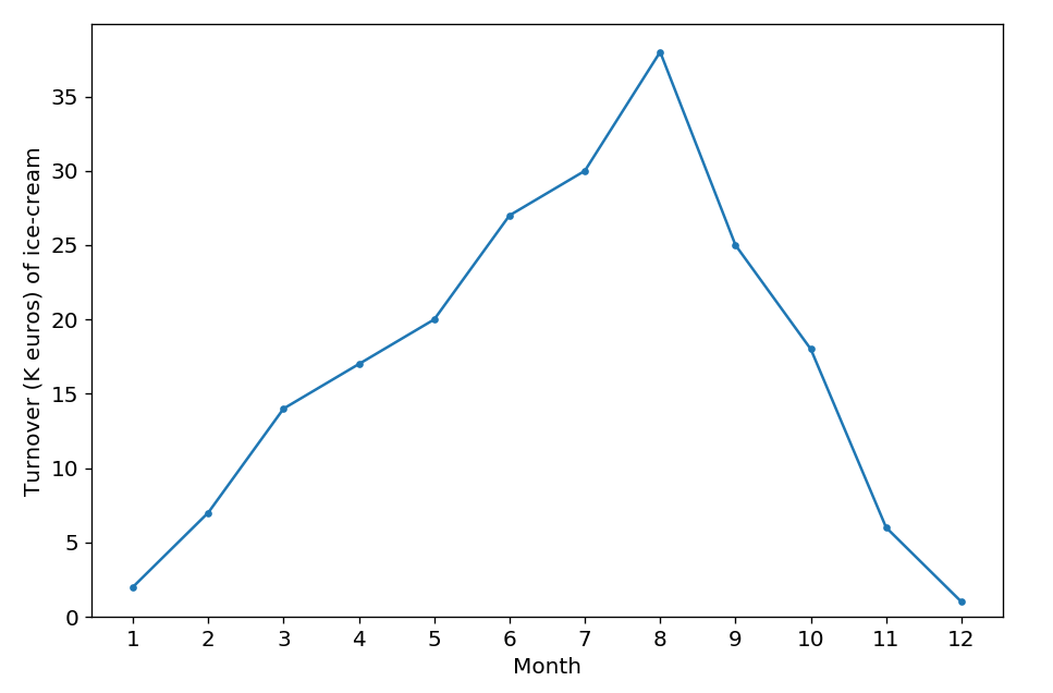
turnover = [2, 7, 14, 17, 20, 27, 30, 38, 25, 18, 6, 1]
plt.plot(np.arange(12), turnover, marker='.')
plt.tick_params(labelsize=12)
plt.xticks(np.arange(12), np.arange(1,13))
plt.xlabel('Month', size=12)
plt.ylabel('Turnover (K euros) of ice-cream', size=12)
plt.ylim(bottom=0)
plt.show()Suppose that the plot above describes the turnover(k euros) of ice-cream’s sales during one year. According to the plot, we can clearly find that the sales reach a peak in summer, then fall from autumn to winter, which is logical.
Line chart with multiple lines
When to use it ?
Compare different subjects during the same period.
Example
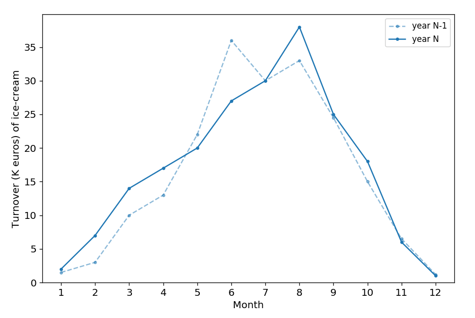
year_n_1 = [1.5, 3, 10, 13, 22, 36, 30, 33, 24.5, 15, 6.5, 1.2]
year_n = [2, 7, 14, 17, 20, 27, 30, 38, 25, 18, 6, 1]

plt.plot(np.arange(12), year_n_1, marker='.', color='#1f77b4',
         label='year N-1', linestyle='--', alpha=0.5)
plt.plot(np.arange(12), year_n, marker='.', color='#1f77b4',
         label='year N')
plt.legend()

plt.show()
As an extension of the first plot, the second one compares two-year turnover together. The peak for both year is in the summer, for year N, the peak is in August; however, the peak is reached in June in the year N-1, which is caused by the heatwave in June.
Add values’ label on the plot
We find that there is no parameter for add values’ labels by plt.plot(), but we can add them with text() function.
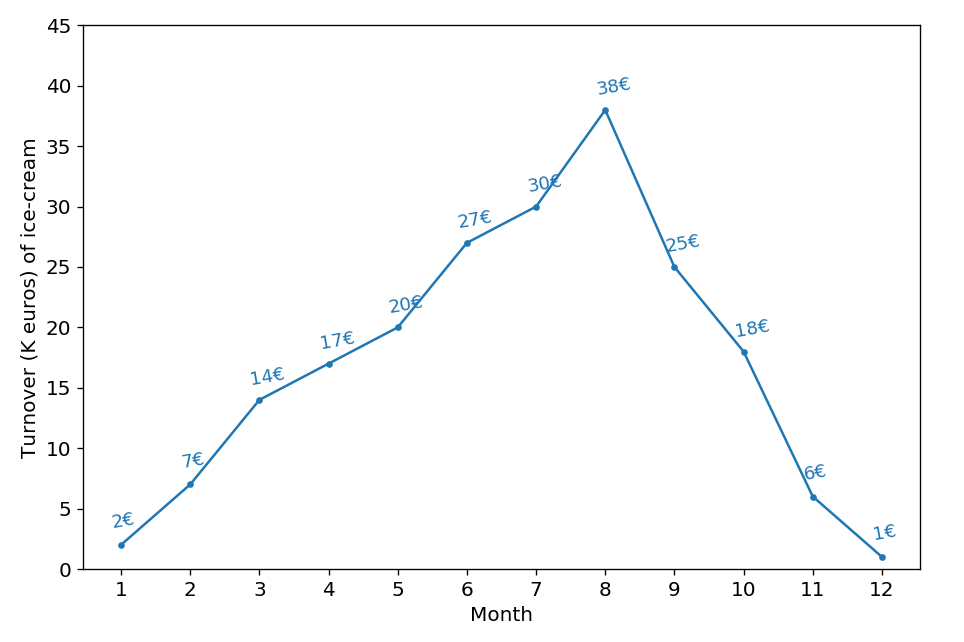
def autolabel_simple_lineplot_mille_wk(df, col_name, lines_color):
    for i, val in enumerate(df[col_name]):
        plt.text(df.index[i]-0.15,
                 val+1.7,
                 '%1.0f€' % val,
                 color=lines_color,
                 rotation=10,
                 fontsize=11)
df = pd.DataFrame({'turnover':[2, 7, 14, 17, 20, 27,
30, 38, 25, 18, 6, 1]})
plt.plot(df.index, df.turnover, marker='.')
autolabel_simple_lineplot_mille_wk(df, 'turnover', '#1f77b4')
plt.show()You can click here to check this example in jupyter notebook.
Reference
- Steve Johnson, “painting wallpaper”, www.pexels.com. [Online]. Available: https://www.pexels.com/photo/painting-wallpaper-1070527/