This blog is part of Matplotlib Series:
- Matplotlib Series 1: Bar chart
- Matplotlib Series 2: Line chart
- Matplotlib Series 3: Pie chart
- Matplotlib Series 4: Scatter plot
- Matplotlib Series 5: Treemap
- Matplotlib Series 6: Venn diagram (this blog)
- Matplotlib Series 7: Area chart
- Matplotlib Series 8: Radar chart
- Matplotlib Series 9: Word cloud
- Matplotlib Series 10: Lollipop plot
- Matplotlib Series 11: Histogram
Venn diagram
A venn diagram (also called primary diagram, set diagram or logic diagram) is a diagram that shows all possible logical relations between a finite collection of different sets.
When to use it ?
- Show logical relations between different groups (intersection, difference, union)
Example 1
import pandas as pd
import matplotlib.pyplot as plt
from matplotlib_venn import venn2
# First way
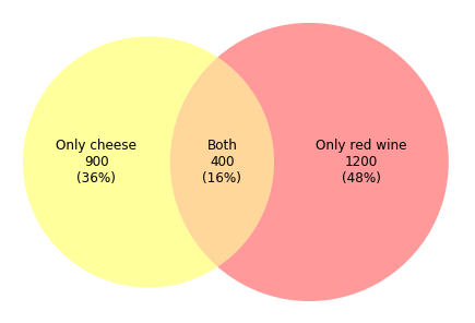
df = pd.DataFrame({'Product': ['Only cheese', 'Only red wine', 'Both'],
'NbClient': [900, 1200, 400]},
columns = ['Product', 'NbClient'])
v2 = venn2(subsets = {'10': df.loc[0, 'NbClient'],
'01': df.loc[1, 'NbClient'],
'11': df.loc[2, 'NbClient']},
set_labels=('', ''))
v2.get_patch_by_id('10').set_color('yellow')
v2.get_patch_by_id('01').set_color('red')
v2.get_patch_by_id('11').set_color('orange')
v2.get_patch_by_id('10').set_edgecolor('none')
v2.get_patch_by_id('01').set_edgecolor('none')
v2.get_patch_by_id('11').set_edgecolor('none')
v2.get_label_by_id('10').set_text('%s\n%d\n(%.0f%%)' % (df.loc[0, 'Product'],
df.loc[0, 'NbClient'],
np.divide(df.loc[0, 'NbClient'],
df.NbClient.sum())*100))
v2.get_label_by_id('01').set_text('%s\n%d\n(%.0f%%)' % (df.loc[1, 'Product'],
df.loc[1, 'NbClient'],
np.divide(df.loc[1, 'NbClient'],
df.NbClient.sum())*100))
v2.get_label_by_id('11').set_text('%s\n%d\n(%.0f%%)' % (df.loc[2, 'Product'],
df.loc[2, 'NbClient'],
np.divide(df.loc[2, 'NbClient'],
df.NbClient.sum())*100))
for text in v2.subset_labels:
text.set_fontsize(12)
plt.show()# Second way
grp1 = set(['cheese-a', 'cheese-b', 'cheese-c', 'cheese-d',
'cheese-e', 'cheese-f', 'cheese-g', 'cheese-h',
'cheese-i', 'cheese', 'red wine'])
grp2 = set(['red wine-a', 'red wine-b', 'red wine-c', 'red wine-d',
'red wine-e', 'red wine-f', 'red wine-g', 'red wine-h',
'red wine-i', 'red wine-j', 'red wine-k', 'red wine-l',
'red wine', 'cheese'])
v2 = venn2([grp1, grp2], set_labels = ('', ''))
v2.get_patch_by_id('10').set_color('yellow')
v2.get_patch_by_id('01').set_color('red')
v2.get_patch_by_id('11').set_color('orange')
v2.get_patch_by_id('10').set_edgecolor('none')
v2.get_patch_by_id('01').set_edgecolor('none')
v2.get_patch_by_id('11').set_edgecolor('none')
v2.get_label_by_id('10').set_text('Only cheese\n(36%)')
v2.get_label_by_id('01').set_text('Only red wine\n(48%)')
v2.get_label_by_id('11').set_text('Both\n(16%)')
plt.show()This kind of venn diagram can usually be used in retail trading. Assuming that we need to study the popularity of cheese and red wine, and 2500 clients answered our questionnaire. According to the diagram above, we find that among 2500 clients, 900 clients(36%) prefer cheese, 1200 clients(48%) prefer red wine, and 400 clients(16%) favor both product.
Example 2
from matplotlib_venn import venn3
v3 = venn3(subsets = {'100':30, '010':30, '110':17,
'001':30, '101':17, '011':17, '111':5},
set_labels = ('', '', ''))
v3.get_patch_by_id('100').set_color('red')
v3.get_patch_by_id('010').set_color('yellow')
v3.get_patch_by_id('001').set_color('blue')
v3.get_patch_by_id('110').set_color('orange')
v3.get_patch_by_id('101').set_color('purple')
v3.get_patch_by_id('011').set_color('green')
v3.get_patch_by_id('111').set_color('grey')
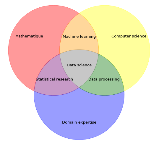
v3.get_label_by_id('100').set_text('Mathematique')
v3.get_label_by_id('010').set_text('Computer science')
v3.get_label_by_id('001').set_text('Domain expertise')
v3.get_label_by_id('110').set_text('Machine learning')
v3.get_label_by_id('101').set_text('Statistical research')
v3.get_label_by_id('011').set_text('Data processing')
v3.get_label_by_id('111').set_text('Data science')
for text in v3.subset_labels:
text.set_fontsize(13)
plt.show()I read an article and imitate its venn diagram as above, which presents different essential capacities for data science related workers.
You can click here to check this example in jupyter notebook.
Reference
- Data Science Venn Diagram by Shelly Palmer 2015
- Custom Venn diagram
- Steve Johnson, “painting wallpaper”, www.pexels.com. [Online]. Available: https://www.pexels.com/photo/painting-wallpaper-1070527/