What should we do if we are curious about the average volume of basket? It’s not enough if we only sum volume of all baskets and divide it by baskets’ amount. We can also explore it with box plot. In this blog, I’ll talk about box plot with following points:
- What is box plot ?
- Understanding box plot with help of probability density function (pdf)
- How to make a box plot by python module
matplotlib? - How to interprete a boxplot ?
What is box plot ?
Box plot is like the plot above. In descriptive statistics, a box plot or boxplot is a method for graphically depicting groups of numerical data through their quartiles. Box plot describes data distribution with 5 measures: minimum, first quartile (Q1), median, third quartile(Q3) and maximum.
- Interquartile range (IQR): 25th to 75th percentile
- Median (Q2): 50th percentile, the middle value of the dataset
- First quartile (Q1): 25th percentile, the middle number between the smallest value (not the “minimum”) and the median of the dataset.
- Third quartile (Q3): 75th percentile, the middle number between the median and the highest value (not the “maximum”) of the dataset.
- Minimum: Q1 - 1.5 * IQR
- Maximum: Q3 + 1.5 * IQR
Understanding box plot with help of probability density function (pdf)
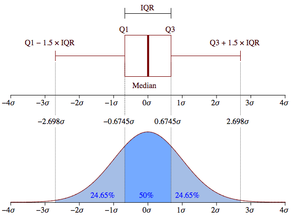
This graph compares the box plot to probability density function (pdf) for a normal distribution. Here I’ll simply interprete the comparison: 50% values of the dataset are in IQR, 7% values are outliers, other values are either between “minimum” and Q1, or between Q3 and “maximum”. If you are interested in detail, you will find it here.
How to make a box plot by python module matplotlib ?

import matplotlib.pyplot as plt
plt.boxplot([ wo_service['Volume'], with_service['Volume'] ])
plt.show()
It’s simple to make a box plot with python module matplotlib, we can apply
box() function and specify the input data. Suppose that wo_service and
with_service are 2 dataframes that contain volume of each basket. This plot
describes the volume distribution for baskets that contain and don’t contain
certain product(s).
How to interprete a boxplot ?
Now we can answer the question at beginning of this blog: what the average volume of basket? Thanks to the box plot above, we can not only understand the volumes’ distribution, but also get the average volume and compare the value between baskets without service and with service, find that the new service brings more sales.
Conclusion
In this blog, I introduced what is box plot, understanding box plot with help of probability density function (pdf), how to make a box plot by python module matplotlib and how to interprete a boxplot. Hope it’s useful for you :)
Reference
- “Box plot”, wikipedia. [Online]. Available: https://en.wikipedia.org/wiki/Box_plot
- Michael Galarnyk, “Understanding Boxplots”, towardsdatascience.com. [Online]. Available: https://towardsdatascience.com/understanding-boxplots-5e2df7bcbd51