Since the internship will be finished in a few days, I’m seeking employment and received several invitations of interview, one of these company is FABERNOVEL DATA & MEDIA. After the first telephone interview, there was a data-analysis test, which is really interesting. Thus, I would like to share with you.
Data
There are 288,425 observations and 12 variables in the dataset, which are extracted from the the web FABERNOVEL and describe various information of web accessing. The following table gives a description of all variables.
| Variables | Description |
|---|---|
date |
The date of contact between user and FABERNOVEL |
hour |
The hour of contact between user and FABERNOVEL website |
userID |
A unique identifier represents a user (may be misinformed) |
medium |
A categorization already carried out of the source of traffic that led the user to the site |
deviceCategory |
The contact takes place via a desktop computer, a mobile phone or a tablet |
regionId |
A code indicates the region where user is located during the contact |
sessions |
The numbre of contacts made |
goalsCompletions |
The number of actions considered as a goal on the site realized by the internauts |
pageviews |
The number of page views on the site |
timeOnPage |
The time spent on the site (the sum of the time spent on each page during a contact) |
transactions |
The number of purchases on the site made by the user |
transactionRevenue |
The turnover realized by the surfer |
Data preprocessing
Moreover, we need to preprocess data before analysing.
- Check missing values
According to View(), we can find that among the column “medium” and “regionId”,
there are missing values expressed as “(none)” or “(not set)”. In order to
remove them, “(none)” and “(not set)” are replaced by NA; then, counting the
amount of missing values with sum(is.na()), in this case, there are 24,791
missing values in the dataset; finally, all missing values are removed.
- Check outliers
Thanks to the blog on site web R-bloggers, which used the
Tukey’s method to identify the outliers ranged below and above the
1.5*IQR(interquartile). In the blog, the author also shares the following R
script that can produce boxplots and histograms with and without outliers, the
proportion of outliers as well.
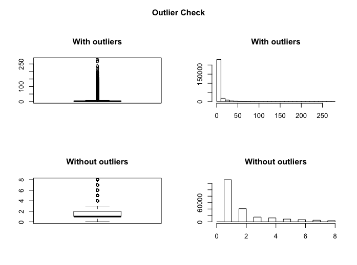
Here, I will show the result of variable pageviews’ outlierCheck as an
example.
> outlierCheck(dataset, pageviews)
Outliers identified: 40767
Proportion (%) of outliers: 18.3
Mean of the outliers: 22.49
Mean without removing outliers: 5.19
Mean if we removing outliers: 2.03
Data visualization
Another thing should not be forgotten before analysing is data visualisation. According to the following graphs, we could see information clearly and efficiently.
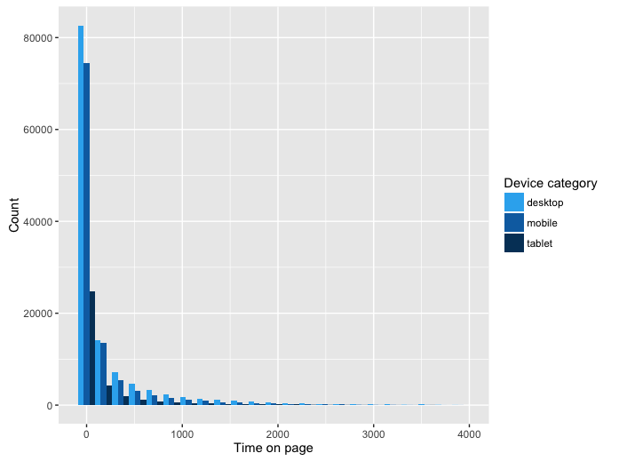
By the histogram above, we can observe that the sum of time spent on one page is mostly shorter than 1000 units; and among 3 device categories, desktops are most used, while the users of tablet are the least.
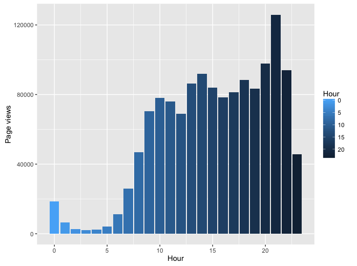
Now, let’s look at this graph, it shows the amount of page views varies with hour. At 7h, the amount of page views increases sharply, that might because people wake up and surf on the net for make themselves to be awake; then it becomes more gradual during the day, and reaches the peak at 21h, this reflects that internauts prefer to surf the internet after dinner; after 21h, the amount of page views decrease until tomorrow morning, as we expect, people go to sleep at night.
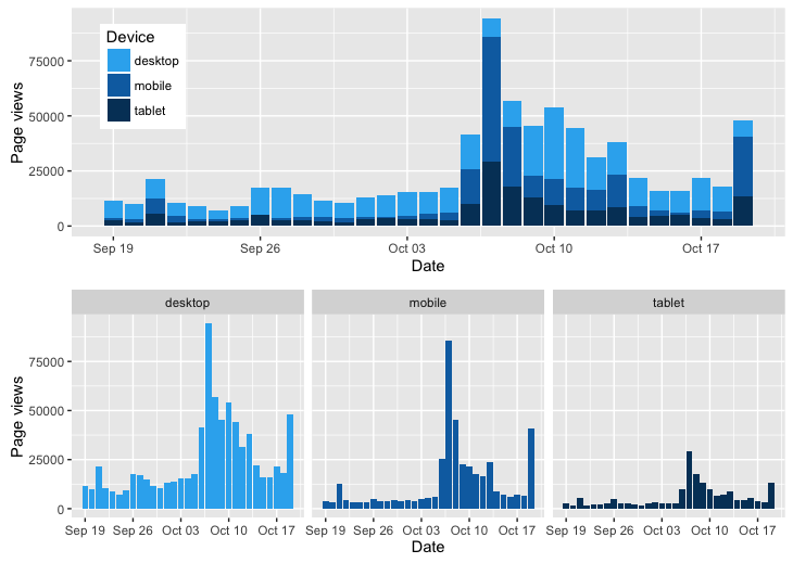
These two graphs describe Page views’ tendency in terms of Date, with respect to different devices. The first graph shows the overlapped page views of 3 devices, which does a favour for comparing directly the page views among all devices; so we can observe that page views’ amount from desktops is the most among three devices, and during the period Sep. 19th - Oct. 19th, webpages are more viewed from 6th October and reach the peak on 7th October, then page views decrease slowly until 18th October and increase suddenly on 19th October. The three graphs which are below the previous one display the tendency of each device separately. Obviously, the results are similar as the first graph, but they contribute to the analysis of Date-Page views relation for each device.
Principal Components Analysis
In order to summarize the dataset while trying at the same time to keep the maximal information contained among the variables. I firstly used the Principal Components Analysis (PCA) technique.
| Component | Sd | Cumulative |
|---|---|---|
| Comp.1 | 1.75685 | 0.44093 |
| Comp.2 | 1.09184 | 0.61123 |
| Comp.3 | 1.00515 | 0.75556 |
| Comp.4 | 0.98331 | 0.89370 |
| Comp.5 | 0.614753 | 0.947681 |
| Comp.6 | 0.492406 | 0.982318 |
| Comp.7 | 0.351811 | 1.000000 |
According to the table above, notice that the explained variance labelled cumulative reaches 80% and increases very little as we add more principal components, so we keep 4 principal components.
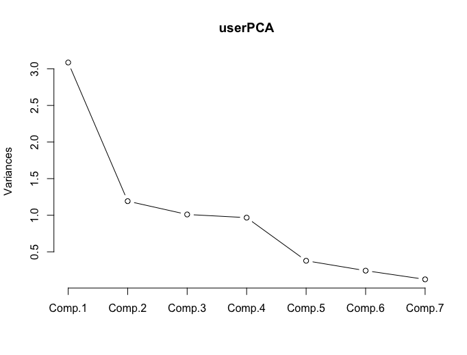
From this graph, we could also get the number of principal components that will be interpreted. The shape of the curve changes after the 4th component. Thus, the same conclusion, we will keep 4 principal components.
By the following, I’ll take the first and the second principal component as an example to interpret the result of PCA.
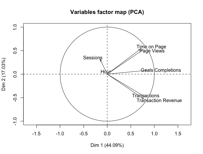
From this scatterplot, we got the
-
Component 1 is correlated positively with timeOnPage, pageviews, goalsCompletions, transactons and transactionRevenue. We also observed that the proportion of explained variance of the first component is 44.09%. Component measures the elements which are most relative to transaction.
-
Component 2 is correlated positively with sessions, hours, timeOnPage, pageviews and goalsCompletions. The proportion of explained variance of the second component is 17.03%. The second component measures the users’ performance of site visiting.
Clustering (k-means)
The second method that I used is Clustering(CL). This technique will enable us to check different groups of observations. Members in each group are similar and close to each other.
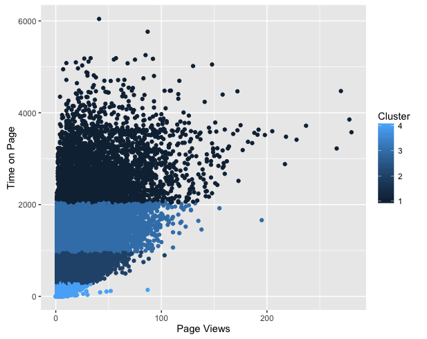
In order to apply Clustering k-means method, we can use the function kmeans().
userKMeans <- kmeans(dataCL, centers = 4)> userKMeans
K-means clustering with 4 clusters of sizes 3589, 31603, 12588,
216232
Within cluster sum of squares by cluster:
[1] 1240837547 1150301678 1142761041 953329798
(between_SS / total_SS = 91.7 %)
Available components:
[1] "cluster" "centers" "totss" "withinss"
[5] "tot.withinss" "betweenss" "size" "iter"
[9] "ifault" The following graph describes Time on Page’s tendency in terms of Page Views, with respect to different clusters. In this graph, four clusters are presented clearly: the internauts in cluster 1 spend more than 2000 units of time on the webpage; the internauts who spend more than 250 time units but less than 1000 time units are in the second cluster; while in the third cluster, the time that people spend on the webpage is between 1000 and 2000 time units; finally, for the people who are in cluster 4, browsing webpage only takes less than 250 time units. In this case, we can make different strategies of internet advertising for different clusters.
Here is what I want to share with you, really enjoyable, right?
If you are interested in the R script, please check it on my Github, all propositions are welcome!
Reference
- freephotocc, “notebook laptop macbook conceptual”, pixabay.com. [Online]. Available: https://pixabay.com/photos/notebook-laptop-macbook-conceptual-1280538/