During last December and January, I participated Big Data courses on the website Coursera, like what I mentioned in my previous blog. Since schedual of the was really substantial, I didn’t have time to summary the knowledge in time, but they will be finished in several weeks. Today the capstone project of this course was finished, I want to firstly share this project with you by this blog.
Context
All the data are about a mobile game, named “Catch the Pink Flamingo”. It’s producted by Eglence Inc. It’s a multi-user game where the players have to catch Pink Flamingos that randomly pop up on a gridded world map based on missions that change in real-time.
Objective
The objective of the game is to catch as many Pink Flamingos as possible by following the missions provided by real-time prompts in the game and cover the map provided for each level. The levels get more complicated in mission speed and map complexity as the users move from level to level.
Problem Statement
In order to increase the revenue generated by the game “Catch The Pink Flamingo”, we need three subjects of datasets.
In the first one, “flamingo-data”, it contains 8 CSV files containing simulated game data and log data for the Catch the Pink Flamingo Simulated Game Data. These data will be used for data exploration in Splunk.
The “combined-data” contains a single CSV file created by aggregating data from several game data files. It is intended to be used for identifying big spenders with KNIME.
And “chat-data” contains 6 CSV files representing simulated chat data related to the Catch the Pink Flamingo game to be used in Graph Analytics with neo4j.
Combining all datasets together, analysing in different technologies will contribute to our decision in increasing revenue from game players.
Data Exploration Overview
Before analysing, let’s make some graphs to understand the data. Importing datasets of ”flamingo-data” into Splunk, using aggregation functions to make histograms as follows.
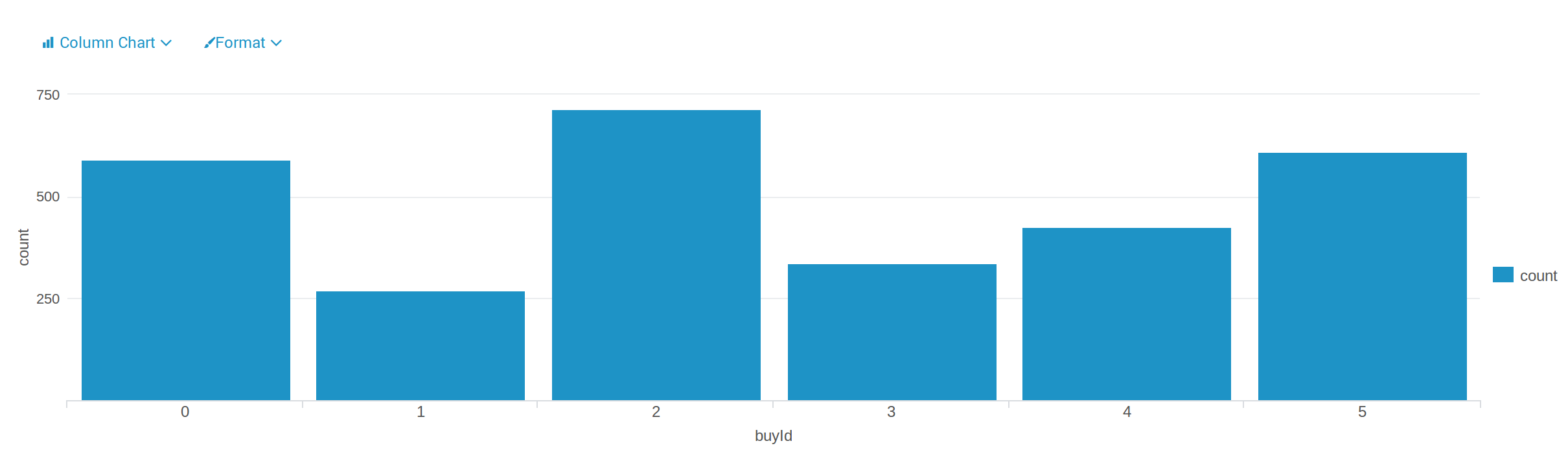
The first histogram is made by the data in “buy-clicks”, which shows how many times each item is purchased. Among six items, the item “2” is the most purchased, the item “1” is the least purchased.
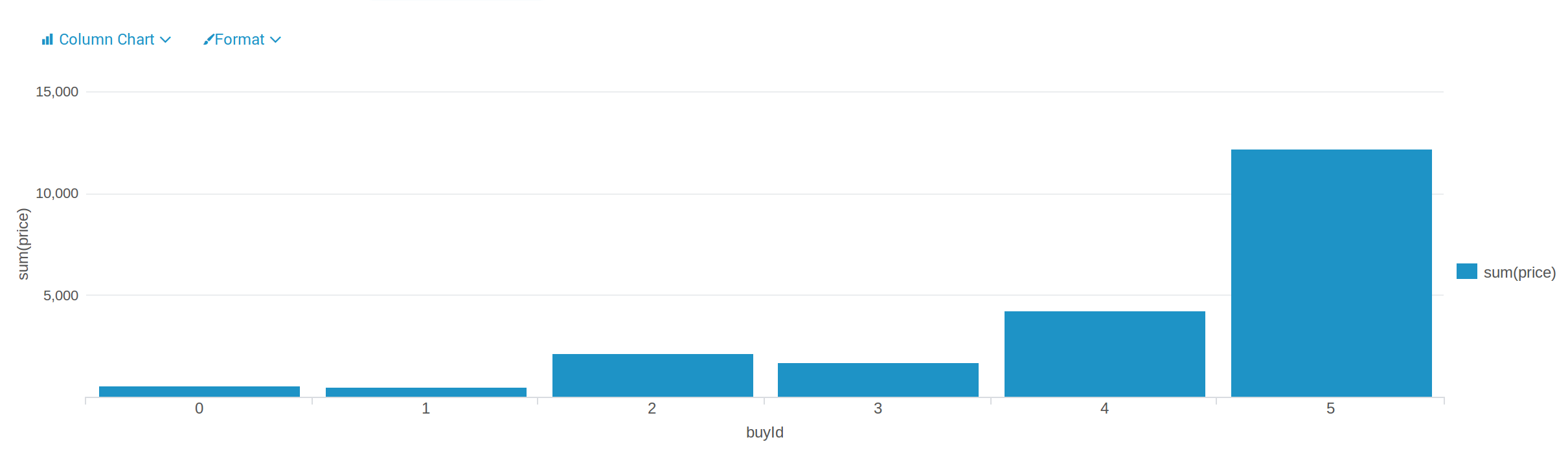
The second one is made by the same dataset. According to this graph, we get different amount of money that made from each item. Among them, the item “5” made the most money, and the item “1” made the least money, which is also the least purchased, it means the item “1” is not preferred by most people. In this case, providers should think about strategies to change this situation or to solve this problem.
Classification
For the first method, we used “combined-data”, and classified users with
Decision Tree in KNIME to identify big spenders in the game. The
objective is to predict which user is likely to purchase big-ticket items while
playing game.
Using the file “combined_data”, we defined two categories for price: HighRollers, who spend more than $5.00 to buy the items, and PennyPinchers, who spend $5.00 or less to buy the items. In this graph, red stands for the PennyPinchers, blue stands for the HighRollers.
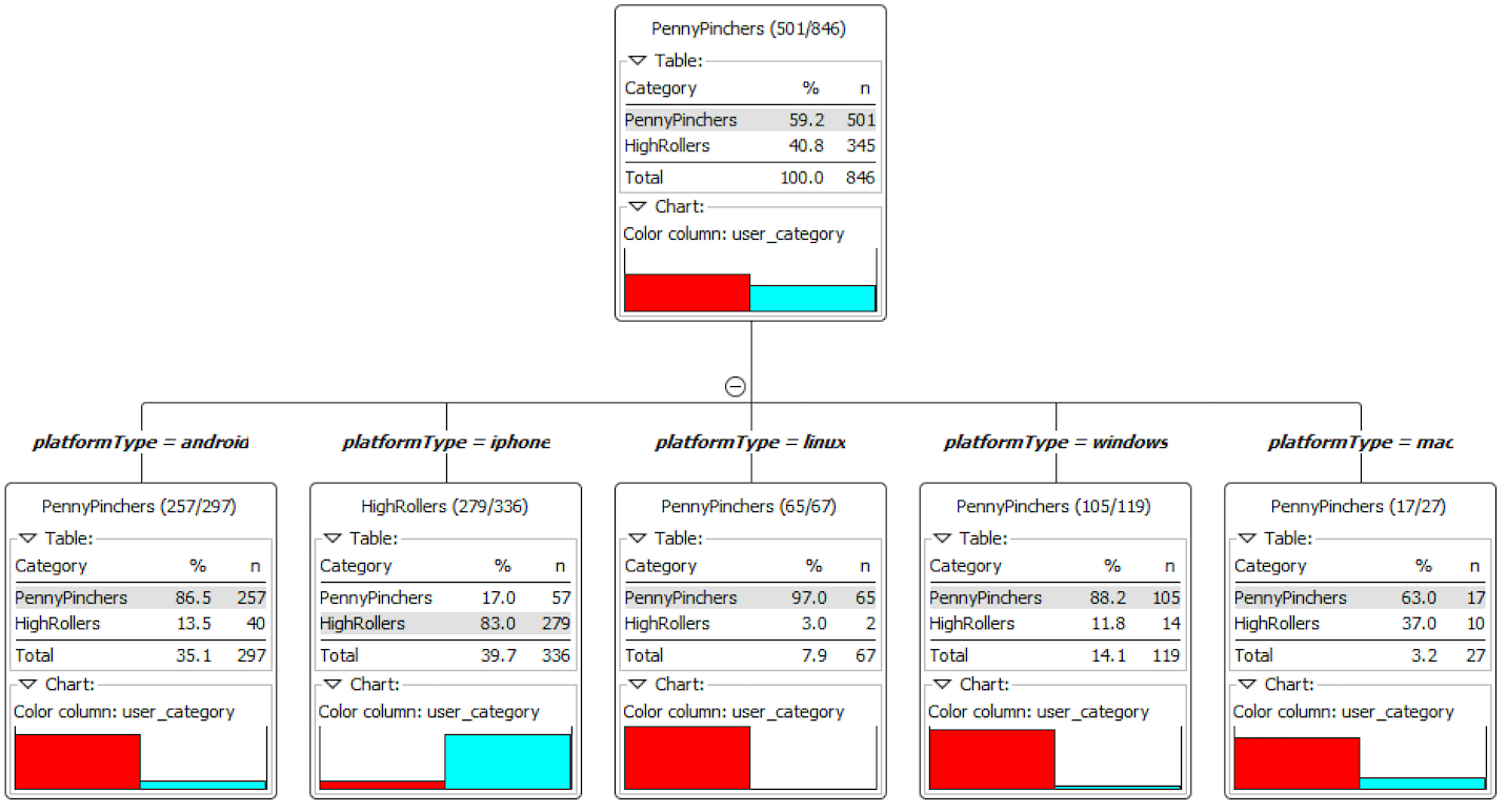
According to the resulting decision tree, it obviously shows that the predicted
user_category is different in various platforms, the users on the platform
android, linux, windows and mac are almost PennyPincher, however, most users
which on the platform iphone are HighRoller.
Furthermore, thanks to the confusion matrix, our model has a 88.5% accuracy rate.
Clustering
In this part, the Clustering method is applied, which is completed in
iPython Notebook with Spark MLlib.
Before beginning, I chose 3 attributes: amount of ad-clicking per user, amount of game-clicking per user and total price spent by each user. Then training data set is created by combining the 3 attributes in a table. Finally, training to create cluster centres and getting the following results.
| Cluster | Total ad clicking | Total game clicking | Revenue |
|---|---|---|---|
| 1 | 25.12 | 362.50 | 35.36 |
| 2 | 32.05 | 2393.95 | 41.20 |
| 3 | 36.47 | 953.82 | 46.16 |
Cluster 1 is different from the others in that the users’ ad-clicks, game-clicks and cost are all less than others, this kind of users can be called “low level spending user”.
Cluster 3 is different from the others in that the users’ ad-clicks, game-clicks and cost are all more than others, this kind of users can be called “high level spending user”.
Cluster 2 is different from the others in that the ad-clicks is not the least, game-clicks is the most but their cost is not the most, this kind of users can be called “neutral user”.
The results reflect that the ad clicking amount of “high level spending user” is 1.45 times more than “low level spending user” and 1.14 times more than “neutral user”; the game clicking amount of “high level spending user” is 2.63 times more than “low level spending user” ; finally, the revenue from “high level spending user” is 1.31 times higher than “low level spending user” and 1.12 times higher than “neutral user”.
Chat Graph Analysis
In the last part, the Chat Graph Analysis is achieved by Neo4J.
The CSV data files of “chat-data” are loaded into Neo4J. Then we firstly find the top 10 chattiest users by matching all users with a CreateChat edge, return the users’ ID and the count of the users.
| Users | Number of Chats |
|---|---|
| 394 | 115 |
| 2067 | 111 |
| 209 | 109 |
| 1087 | 109 |
| 554 | 107 |
| 516 | 105 |
| 1627 | 105 |
| 999 | 105 |
| 668 | 104 |
| 461 | 104 |
Secondly, we find the top 10 chattiest teams by matching all ChatItems with a PartOf edge connecting them with a TeamChatSession node and the TeamChatSession nodes must have an OwnedBy edge connecting them with any other node, and return the count of teams as well.
| Teams | Number of Chats |
|---|---|
| 82 | 1324 |
| 185 | 1306 |
| 112 | 957 |
| 18 | 844 |
| 194 | 836 |
| 129 | 814 |
| 52 | 788 |
| 136 | 783 |
| 146 | 746 |
| 81 | 736 |
According to the first two tables, we get the third table which identifies among the top 10 chattiest users, one of them belongs to chattiest teams, i.e. the user “999” belongs to the team “52”, but other 9 users are not part of the top 10 chattiest teams. This states that most of the chattiest users are not in the chattiest teams.
| Users | Teams | Number of Chats |
|---|---|---|
| 394 | 63 | 115 |
| 2067 | 7 | 111 |
| 209 | 7 | 109 |
| 1087 | 77 | 109 |
| 554 | 181 | 107 |
| 516 | 7 | 105 |
| 1627 | 7 | 105 |
| 999 | 52 | 105 |
| 461 | 104 | 104 |
| 668 | 89 | 104 |
Recommendation
Following previous results, here are some recommendations to be considered:
-
Offer more products to iPhone users. According to the decision tree classification, it reflects that most users which on the platform iPhone are HighRollers, so offering more products to them can increase our revenue.
-
Provide more products to “high level spending user”, which is similar as the first one, but the users are not totally identical. Thanks to Clustering results, we know that the “high level spending user” clicked less but buy more than others, we can provide more products to them for increasing the revenue.
-
Provide some fixed pay packages or promotion to users, especially to “low level spending user”. This action can stimulate consumption of users, and since the paying probability of “low level spending user” is low, the promotion can encourage them to purchase.
Moreover, you can consult the slides and technical appendix on my GitHub, all propositions are welcome!
Easter Egg
After finishing all courses in Big Data specilization, I got a certificate as follows.
Thanks to the courses, I had a better understanding of Big Data, and got my dream job, Data Scientist. Well, a new journey will begin!
Reference
- Yucel Moran, “flock of flamingo on body of water”, unsplash.com. [Online]. Available: https://unsplash.com/photos/AiEL7IwzzMg