Matplotlib is a well-known python library used for data visualisation, we
usually create static plots with it. But how if we create animated graph to
present the evolution in terms of time? In this blog, I will show you how to
create animated graphs with matplotlib in the following point:
- Libraries
- Data preparation
- Animated graph with static legend
- Animated graph with animated legend
Libraries
import pandas as pd
from datetime import date
from dateutil.relativedelta import relativedelta

import matplotlib.pyplot as plt
import matplotlib.animation as animation
from matplotlib.dates import DateFormatter
from matplotlib.ticker import FuncFormatter, MultipleLocator
Data preparation
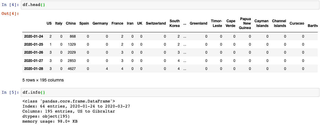
Here I use a dataset which contains the daily cumulative confirmed COVID-19 cases of each country, for the animated graph, I’ll use the top 6 countries.
Animated graph with static legend
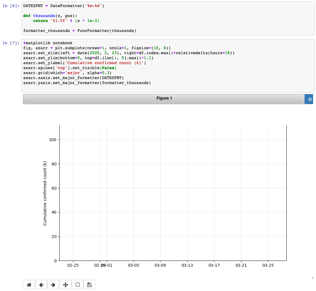
Firstly, I will create a figure with necessary parameters:
DATESFMT = DateFormatter('%m-%d')

def thousands(x, pos):
    return '%1.0f' % (x * 1e-3)

formatter_thousands = FuncFormatter(thousands)

fig, axarr = plt.subplots(nrows=1, ncols=1, figsize=(10, 6))
axarr.set_xlim(left = date(2020, 2, 23), right=df.index.max()+relativedelta(hours=18))
axarr.set_ylim(bottom=0, top=df.iloc[:, 0].max()*1.1)
axarr.set_ylabel('Cumulative confirmed count (k)')
axarr.spines['top'].set_visible(False)
axarr.grid(which='major', alpha=0.3)
axarr.xaxis.set_major_formatter(DATESFMT)
axarr.yaxis.set_major_formatter(formatter_thousands)
def animate(i):
data = df.loc[date(2020, 2, 23):, :].iloc[:int(i+1)] #select data range
p_us = axarr.plot(data.index, data['US'],
label='US', color='tab:blue')
p_italy = axarr.plot(data.index, data['Italy'],
label='Italy', color='tab:orange')
p_cn = axarr.plot(data.index, data['China'],
label='China', color='tab:green')
p_spain = axarr.plot(data.index, data['Spain'],
label='Spain', color='tab:red')
p_germany = axarr.plot(data.index, data['Germany'],
label='Germany', color='tab:purple')
p_france = axarr.plot(data.index, data['France'],
label='France', color='tab:brown')
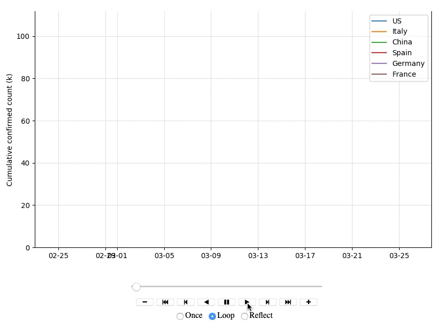
plt.legend(['US', 'Italy', 'China', 'Spain', 'Germany', 'France'])
ctry_ts = animation.FuncAnimation(fig, animate, frames=51, repeat=True,
interval=500, repeat_delay=2000)
ctry_ts.save('top6_countries_static_legend.html')We need to create a function animate() to create the animate plot frame by
frame, then apply it with matplotlib.animation.FuncAnimation().
I set frames=51 since we have data on 51 different days; interval means the
delay between frames in milliseconds; if the animation in repeated, adds a
repeat_delay in milliseconds before repeating the animation. Thus, the result
should like:
Animated graph with animated legend
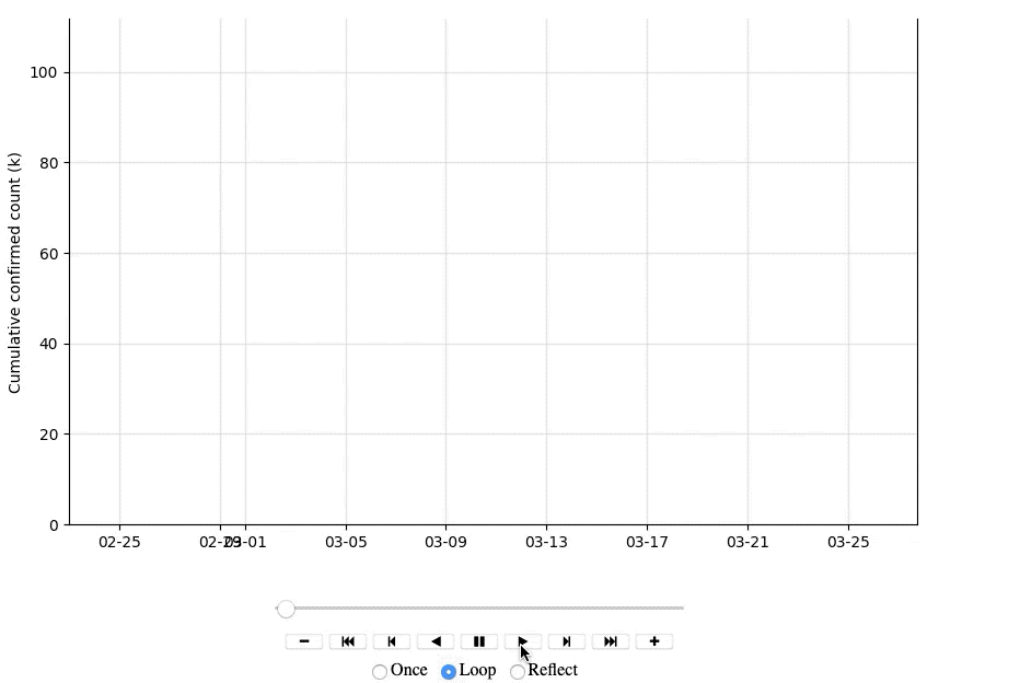
In the animated graph above, the legend for each line is fixed at the corner,
it’s not convenient to distinct the country when we focus on the changes of each
line. Why not animate the legends and let them move with lines? It’s similar as
the steps for the graph above, but we need to add the text into the graph with
annotate().
fig, axarr = plt.subplots(nrows=1, ncols=1, figsize=(10, 6))
axarr.set_xlim(left = date(2020, 2, 23), right=df.index.max()+relativedelta(hours=18))
axarr.set_ylim(bottom=0, top=df.iloc[:, 0].max()*1.1)
axarr.set_ylabel('Cumulative confirmed count (k)')
axarr.spines['top'].set_visible(False)
axarr.grid(which='major', alpha=0.3)
axarr.xaxis.set_major_formatter(DATESFMT)
axarr.yaxis.set_major_formatter(formatter_thousands)

annotation_us = axarr.annotate('US (0)', xy=(date(2020, 2, 22), 0),
                               xytext=(date(2020, 2, 22),0))
annotation_it = axarr.annotate('Italy (0)', xy=(date(2020, 2, 22), 0),
                               xytext=(date(2020, 2, 22),0))
annotation_cn = axarr.annotate('China (0)', xy=(date(2020, 2, 22), 0),
                               xytext=(date(2020, 2, 22),0))
annotation_es = axarr.annotate('Spain (0)', xy=(date(2020, 2, 22), 0),
                               xytext=(date(2020, 2, 22),0))
annotation_de = axarr.annotate('Germany (0)', xy=(date(2020, 2, 22), 0),
                               xytext=(date(2020, 2, 22),0))
annotation_fr = axarr.annotate('France (0)', xy=(date(2020, 2, 22), 0),
                               xytext=(date(2020, 2, 22),0))
def animate(i):
data = df.loc[date(2020, 2, 23):, :].iloc[:int(i+1)] #select data range
p_us = axarr.plot(data.index, data['US'],
label='US', color='tab:blue')
p_italy = axarr.plot(data.index, data['Italy'],
label='Italy', color='tab:orange')
p_cn = axarr.plot(data.index, data['China'],
label='China', color='tab:green')
p_spain = axarr.plot(data.index, data['Spain'],
label='Spain', color='tab:red')
p_germany = axarr.plot(data.index, data['Germany'],
label='Germany', color='tab:purple')
p_france = axarr.plot(data.index, data['France'],
label='France', color='tab:brown')
annotation_us.set_position((data.index.max()+relativedelta(hours=-18),
data['US'].max()+1000))
annotation_us.xy = (data.index.max()+relativedelta(hours=-18),
data['US'].max()+1000)
annotation_us.set_text('US (%d)' % data['US'].max())
annotation_it.set_position((data.index.max()+relativedelta(hours=-18),
data['Italy'].max()+1000))
annotation_it.xy = (data.index.max()+relativedelta(hours=-18),
data['Italy'].max()+1000)
annotation_it.set_text('Italy (%d)' % data['Italy'].max())
annotation_cn.set_position((data.index.max()+relativedelta(hours=-18),
data['China'].max()+1000))
annotation_cn.xy = (data.index.max()+relativedelta(hours=-18),
data['China'].max()+1000)
annotation_cn.set_text('China (%d)' % data['China'].max())
annotation_es.set_position((data.index.max()+relativedelta(hours=-18),
data['Spain'].max()+1000))
annotation_es.xy = (data.index.max()+relativedelta(hours=-18),
data['Spain'].max()+1000)
annotation_es.set_text('Spain (%d)' % data['Spain'].max())
annotation_de.set_position((data.index.max()+relativedelta(hours=-18),
data['Germany'].max()+1000))
annotation_de.xy = (data.index.max()+relativedelta(hours=-18),
data['Germany'].max()+1000)
annotation_de.set_text('Germany (%d)' % data['Germany'].max())
annotation_fr.set_position((data.index.max()+relativedelta(hours=-18),
data['France'].max()+1000))
annotation_fr.xy = (data.index.max()+relativedelta(hours=-18),
data['France'].max())
annotation_fr.set_text('France (%d)' % data['France'].max())
ctry_ts = animation.FuncAnimation(fig, animate, frames=51, repeat=True,
interval=500, repeat_delay=2000)
ctry_ts.save('top6_countries_animated_legend.html')I firstly set the text with annotate() when I created the figure, then in the
function animate() I updated the annotation position and text with
.set_position(), .xy and .set_text(). Thus, the result is like:
If you are interested in the scripts, please find them here.
Reference
- Viviane, “How to Create Animated Graphs in Python”, towardsdatascience.com. [Online]. Available: https://towardsdatascience.com/how-to-create-animated-graphs-in-python-bb619cc2dec1
- Louis Tiao, “Save Matplotlib Animations as GIFs”, louistiao.me. [Online]. Available: http://louistiao.me/posts/notebooks/save-matplotlib-animations-as-gifs/
- Thomas Kühn, “Animate points with labels with matplotlib”, stackoverflow.com. [Online]. Available: https://stackoverflow.com/questions/18351932/animate-points-with-labels-with-matplotlib?noredirect=1&lq=1
- jarmoluk, “innovation business information”, pixabay.com. [Online]. Available: https://pixabay.com/photos/innovation-business-information-561388/