A map can clearly present information in terms of geography. Recently I learnt
how to realize geovisualization with folium module in Python. In this blog, I
will talk about how to draw a different types of map like with the following
points:
- Datasets
- Display all locations with points on the map
- Display all locations with clusters
- Paint areas with different colors
- Add labels on the map
- Add polygon borders
- Show changes in terms of timing with heatmap
- Show changes in terms of timing with choropleth
Datasets
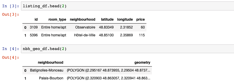
Before drawing maps, I’ll talk about the datasets which are used for this blog. I downloaded Airbnb Paris’ datasets “listings” and “neighbourhoods”.
import pandas as pd
import geopandas as gpd

listing_df = pd.read_csv('listings.csv', parse_dates=['last_review'])
nbh_geo_df = gpd.read_file('neighbourhoods.geojson', driver='GeoJSON')
listing_df = listing_df[['id', 'room_type', 'neighbourhood',
                         'latitude', 'longitude', 'price']]
nbh_geo_df = nbh_geo_df[['neighbourhood', 'geometry']]
from shapely.geometry import Point, shape

locs_geometry = [Point(xy) for xy in zip(listing_df.longitude,
                                         listing_df.latitude)]
crs = {'init': 'epsg:4326'}
# Coordinate Reference Systems, "epsg:4326" is a common projection of WGS84 Latitude/Longitude
locs_gdf = gpd.GeoDataFrame(listing_df, crs=crs, geometry=locs_geometry)
In order to put points on the map, we need to convert each coordinate to geopoint, same for the dataframe.
Display all locations with points on the map
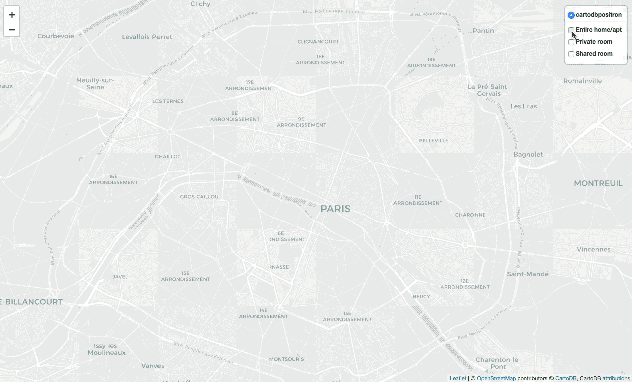
import folium
locs_map = folium.Map(location=[48.856614, 2.3522219],
                      zoom_start=13, tiles='cartodbpositron')

feature_ea = folium.FeatureGroup(name='Entire home/apt')
feature_pr = folium.FeatureGroup(name='Private room')
feature_sr = folium.FeatureGroup(name='Shared room')

for i, v in locs_gdf.iterrows():
    popup = """
    Location id : <b>%s</b><br>
    Room type : <b>%s</b><br>
    Neighbourhood : <b>%s</b><br>
    Price : <b>%d</b><br>
    """ % (v['id'], v['room_type'], v['neighbourhood'], v['price'])

    if v['room_type'] == 'Entire home/apt':
        folium.CircleMarker(location=[v['latitude'], v['longitude']],
                            radius=1,
                            tooltip=popup,
                            color='#FFBA00',
                            fill_color='#FFBA00',
                            fill=True).add_to(feature_ea)
    elif v['room_type'] == 'Private room':
        folium.CircleMarker(location=[v['latitude'], v['longitude']],
                            radius=1,
                            tooltip=popup,
                            color='#087FBF',
                            fill_color='#087FBF',
                            fill=True).add_to(feature_pr)
    elif v['room_type'] == 'Shared room':
        folium.CircleMarker(location=[v['latitude'], v['longitude']],
                            radius=1,
                            tooltip=popup,
                            color='#FF0700',
                            fill_color='#FF0700',
                            fill=True).add_to(feature_sr)

feature_ea.add_to(locs_map)
feature_pr.add_to(locs_map)
feature_sr.add_to(locs_map)
folium.LayerControl(collapsed=False).add_to(locs_map)
There are numerous marker types, I apply CircleMarker with a popup(input
text or visualization for object displayed when clicking) and tooltip(display
a text when hovering over the object), apply LayerControl to filter different
types of locations.
Display all locations with clusters
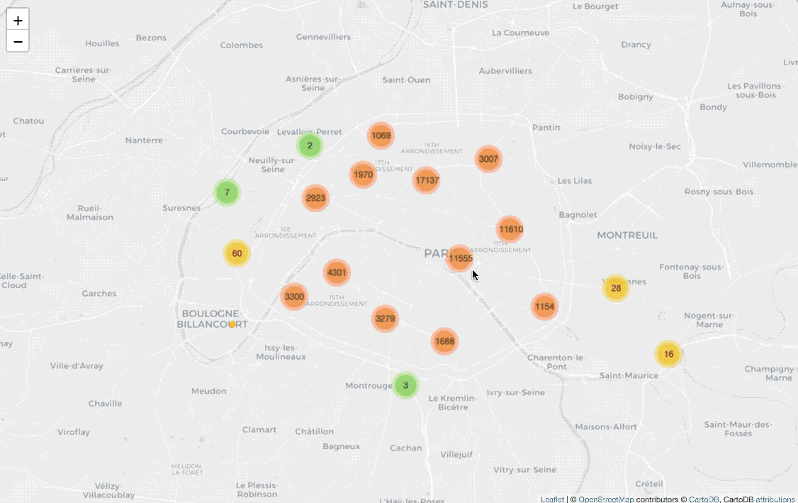
from folium import plugins

cluster_map = folium.Map(location=[48.856614, 2.3522219],
                         zoom_start=13, tiles='cartodbpositron')

marker_cluster = plugins.MarkerCluster().add_to(cluster_map)
for i, v in locs_gdf.iterrows():
    popup = """
    Location id : <b>%s</b><br>
    Room type : <b>%s</b><br>
    Neighbourhood : <b>%s</b><br>
    Price : <b>%d</b><br>
    """ % (v['id'], v['room_type'], v['neighbourhood'], v['price'])

    if v['room_type'] == 'Entire home/apt':
        folium.CircleMarker(location=[v['latitude'], v['longitude']],
                            radius=3,
                            tooltip=popup,
                            color='#FFBA00',
                            fill_color='#FFBA00',
                            fill=True).add_to(marker_cluster)
    elif v['room_type'] == 'Private room':
        folium.CircleMarker(location=[v['latitude'], v['longitude']],
                            radius=3,
                            tooltip=popup,
                            color='#087FBF',
                            fill_color='#087FBF',
                            fill=True).add_to(marker_cluster)
    elif v['room_type'] == 'Shared room':
        folium.CircleMarker(location=[v['latitude'], v['longitude']],
                            radius=3,
                            tooltip=popup,
                            color='#FF0700',
                            fill_color='#FF0700',
                            fill=True).add_to(marker_cluster)
Before drawing CircleMarker on the map, I add plugins.MarkerCluster() on
the map for clustering coordinates.
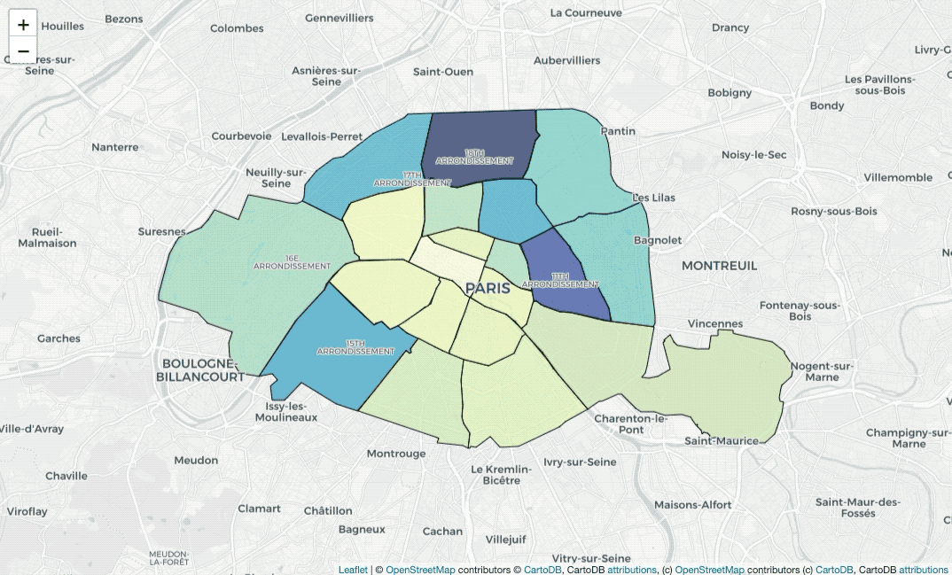
Paint areas with different colors
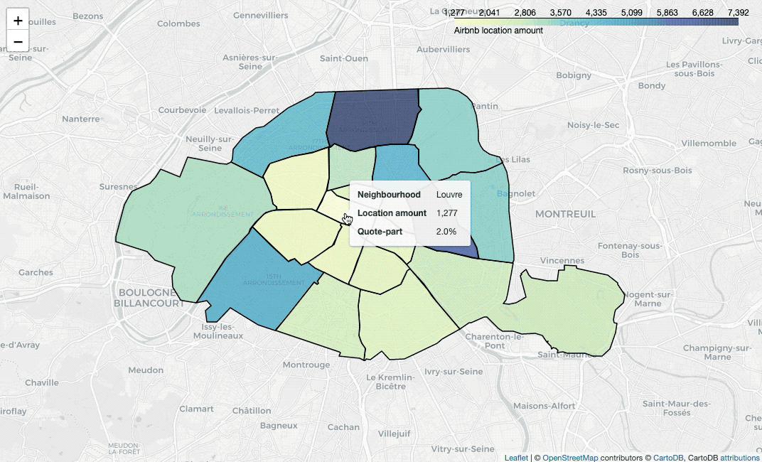
nbh_count_df = listing_df.groupby('neighbourhood')['id'].nunique().reset_index()
nbh_count_df.rename(columns={'id':'nb'}, inplace=True)
nbh_geo_count_df = pd.merge(nbh_geo_df, nbh_count_df, on='neighbourhood')
nbh_geo_count_df['QP'] = nbh_geo_count_df['nb'] / nbh_geo_count_df['nb'].sum()
nbh_geo_count_df['QP_str'] = nbh_geo_count_df['QP'].apply(lambda x : str(round(x*100, 1)) + '%')

from branca.colormap import linear
nbh_count_colormap = linear.YlGnBu_09.scale(min(nbh_count_df['nb']),
                                            max(nbh_count_df['nb']))

nbh_locs_map = folium.Map(location=[48.856614, 2.3522219],
                          zoom_start = 12, tiles='cartodbpositron')

style_function = lambda x: {
    'fillColor': nbh_count_colormap(x['properties']['nb']),
    'color': 'black',
    'weight': 1.5,
    'fillOpacity': 0.7
}

folium.GeoJson(
    nbh_geo_count_df,
    style_function=style_function,
    tooltip=folium.GeoJsonTooltip(
        fields=['neighbourhood', 'nb', 'QP_str'],
        aliases=['Neighbourhood', 'Location amount', 'Quote-part'],
        localize=True
    )
).add_to(nbh_locs_map)

nbh_count_colormap.add_to(nbh_locs_map)
nbh_count_colormap.caption = 'Airbnb location amount'
nbh_count_colormap.add_to(nbh_locs_map)
To paint areas in terms of locations’ average price, we need to calculate the
values firstly. Then use branca.colormap.linear to set colormap, insert the
colormap into style_function, plot a GeoJSON overlay on the base map with
folium.GeoJson, then we can draw the map.
Add labels on the map
nbh_locs_label_map = folium.Map(location=[48.856614, 2.3522219],
                                zoom_start = 12, tiles='cartodbpositron')

style_function = lambda x: {
    'fillColor': nbh_count_colormap(x['properties']['nb']),
    'color': 'black',
    'weight': 1,
    'fillOpacity': 0.7
}

folium.GeoJson(
    nbh_geo_count_df,
    style_function=style_function,
    tooltip=folium.GeoJsonTooltip(
        fields=['neighbourhood', 'nb', 'QP_str'],
        aliases=['Neighbourhood', 'Location amount', 'Quote-part'],
        localize=True
    )
).add_to(nbh_locs_label_map)

folium.map.CustomPane('labels').add_to(nbh_locs_label_map)
folium.TileLayer('CartoDBPositronOnlyLabels',
                 pane='labels').add_to(nbh_locs_label_map)
Do you notice that? The labels are usually covered by painted colors. In this
case, I used folium.TileLayer to add CartoDBPositronOnlyLabels on the map,
so that we add another labels’ layer.
Add polygon borders
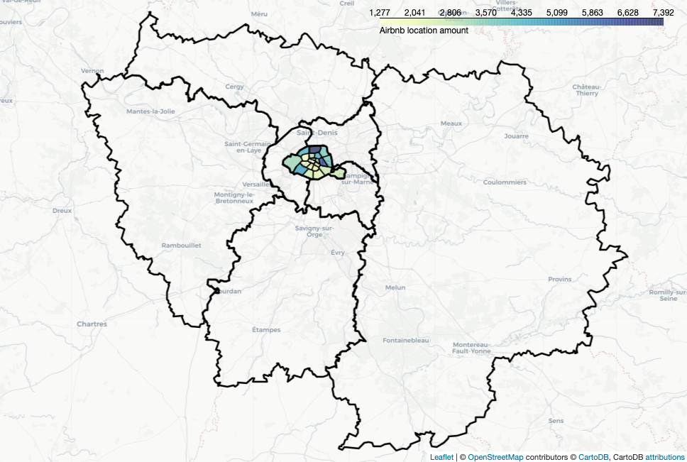
dept_geo = gpd.read_file('departements.geojson', driver='GeoJSON')
departments = {'75', '77', '78', '91', '92', '93', '94', '95'}
dept_geo = dept_geo[dept_geo['code'].isin(departments)]

polygon_map = folium.Map(location=[48.716614, 2.3522219],
                         zoom_start = 9, tiles='cartodbpositron')

style_function = lambda x: {
    'fillColor': nbh_count_colormap(x['properties']['nb']),
    'color': 'black',
    'weight': 1.5,
    'fillOpacity': 0.7
}

folium.GeoJson(
    nbh_geo_count_df,
    style_function=style_function,
    tooltip=folium.GeoJsonTooltip(
        fields=['neighbourhood', 'nb', 'QP_str'],
        aliases=['Neighbourhood', 'Location amount', 'Quote-part'],
        localize=True
    )
).add_to(polygon_map)

folium.GeoJson(
    dept_geo,
    style_function = lambda x: {
        'color': 'black',
        'weight': 2.5,
        'fillOpacity': 0
    },
    name='Departement').add_to(polygon_map)

nbh_count_colormap.add_to(polygon_map)
nbh_count_colormap.caption = 'Airbnb location amount'
nbh_count_colormap.add_to(polygon_map)
I downloaded Ile-de-France’s geojson data from here. To draw
polygons’ border, the only thing that we need to do is add the polygons’
coordinates and set fillOpacity to be 0.
Show changes in terms of timing with heatmap
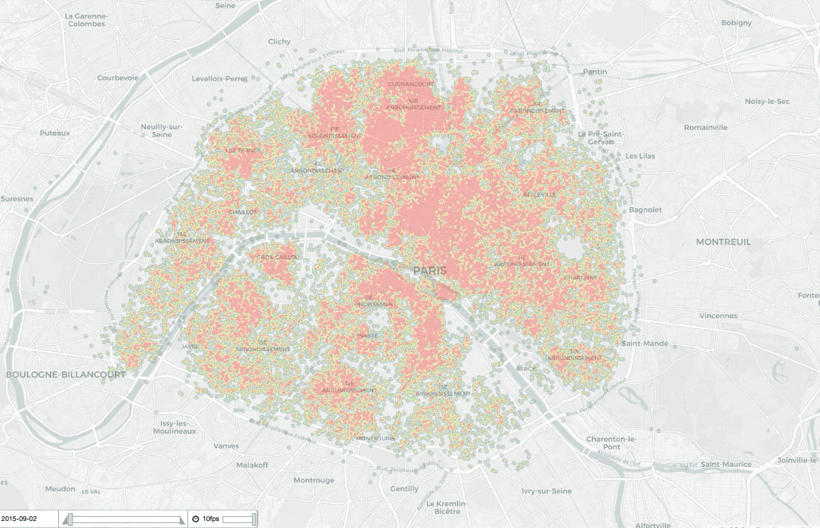
date_index = [d.strftime('%Y-%m-%d') for d in listing_summary_history.date_of_data.unique()][::-1]

locs_history_map = folium.Map(location=[48.856614, 2.3522219],
                              zoom_start = 13, tiles='cartodbpositron')

hm = plugins.HeatMapWithTime(
    data=locs_yearly,
    index=date_index,
    auto_play=True,
    radius=4,
    max_opacity=0.3
)

hm.add_to(locs_history_map)
For presenting the changes in terms of time on a heatmap, we can apply
plugins.HeatMapWithTime(). data is the points you want to plot, which is a
list of list of points of the form [lat, lng] or [lat, lng, weight]. index
gives the label (or timestamp) of the elements of data, should be the same
length as data, or is replaced by a simple count if not specified.
Show changes in terms of timing with choropleth
nbh_locsNb_history = listing_summary_history.groupby(['date_of_data',
                                                      'neighbourhood'])['id'].nunique().reset_index()
nbh_locsNb_history.rename(columns={'id':'nb'}, inplace=True)
nbh_locsNb_history.sort_values(['neighbourhood', 'date_of_data'],
                               inplace=True)
nbh_locsNb_history.reset_index(drop=True, inplace=True)

nbh_geo_sorted_df = nbh_geo_df.sort_values('neighbourhood').reset_index(drop=True)
The map above describes the price’s changes of each neighbourhood in terms of time series. Thus, before making the map, we need to calculate the average location’s price for each neighbourhood each year.
datetime_index = pd.DatetimeIndex(nbh_locsNb_history.date_of_data.unique())
dt_index_epochs = datetime_index.astype(int) // 10**9
dt_index = np.array(dt_index_epochs).astype('U10')
Then I prepared convert datetime to U10 with pandas.DatetimeIndex() and
astype().
styledata = {}
s = 0
e = 44
for i, v in nbh_geo_sorted_190709.iterrows():
    df = pd.DataFrame(
        {'color': np.array(nbh_locsNb_history.nb[s:e]),
         'opacity': np.array([1] * 44)},
        index=dt_index
    )
    styledata[i] = df
    s += 44
    e += 44

max_color = max(nbh_locsNb_history['nb'])
min_color = min(nbh_locsNb_history['nb'])
max_opacity, min_opacity = 1, 1

cmap = linear.YlGnBu_09.scale(min_color, max_color)

def norm(x):
    return (x - x.min()) / (x.max() - x.min())

for i, data in styledata.items():
    data['color'] = data['color'].map(cmap)
    data['opacity'] = 1

styledict = {
    str(nbh): data.to_dict(orient='index') for nbh, data in styledata.items()
}
The last step is to define a color map in terms of neighbourhoods’ prices for each year.
from folium.plugins import TimeSliderChoropleth

nbh_locs_history_map = folium.Map(location=[48.856614, 2.3522219],
                                  zoom_start = 12, tiles='cartodbpositron')

TimeSliderChoropleth(
    data=nbh_geo_sorted_190709.to_json(),
    styledict=styledict
).add_to(nbh_locs_history_map)
We can apply TimeSliderChoropleth to draw the time series map. data should
be geojson string, styledict is the dictionary where the keys are the geojson
feature ids and the values are dicts of {time: style_options_dict}.
Reference
- “Inside Airbnb”, insideairbnb.com. [Online]. Available: http://insideairbnb.com/get-the-data.html
- Grégoire David, “france-geojson”, github.com. [Online]. Available: https://github.com/gregoiredavid/france-geojson
- “Popups”, jupyter.org. [Online]. Available: https://nbviewer.jupyter.org/github/python-visualization/folium/blob/master/examples/Popups.ipynb
- “MarkerCluster”, jupyter.org. [Online]. Available: https://nbviewer.jupyter.org/github/python-visualization/folium/blob/master/examples/MarkerCluster.ipynb
- “Colormaps”, jupyter.org. [Online]. Available: https://nbviewer.jupyter.org/github/python-visualization/folium/blob/master/examples/Colormaps.ipynb
- “CustomPanes”, jupyter.org. [Online]. Available: https://nbviewer.jupyter.org/github/python-visualization/folium/blob/master/examples/CustomPanes.ipynb
- “GeoJSON_and_choropleth”, jupyter.org. [Online]. Available: [https://nbviewer.jupyter.org/github/python-visualization/folium/blob/master/examples/GeoJSON_and_choropleth.ipynb[GeoJSON_and_choropleth
- “HeatMapWithTime”, jupyter.org. [Online]. Available: https://nbviewer.jupyter.org/github/python-visualization/folium/blob/master/examples/HeatMapWithTime.ipynb
- “TimeSliderChoropleth”, jupyter.org. [Online]. Available: https://nbviewer.jupyter.org/github/python-visualization/folium/blob/master/examples/TimeSliderChoropleth.ipynb
- WikiImages, “Earth map summer July continents”, pixabay.com_. [Online]. Available: https://pixabay.com/photos/earth-map-summer-july-continents-11048/